Blur for a Better UI
I got this idea from watching Garry Tan‘s Y Combinator Startup School talk about Design for Startups.
The Curse of Knowledge applies to web design. Knowing how a site or component is supposed to work means it’s harder to put yourself in the shoes of a new user. The new user is learning how the site (or app) works.
The unknown is uncomfortable. Like learning any new subject, it starts with learning the basics and then learning more details over time. Learning the basics turns the biggest chunks of scary unknowns into known concepts.
The new user is taking cues from the site’s design about what to expect. A bold, colorful, or prominent feature is probably more important than a small, unadorned, component. A contrasting color or pattern draws attention to important parts.
What happens when the design applies focus to less important features? The new user isn’t gaining knowledge as fast as they could. They’re influenced to look into the details while still wondering about the main topics. If this takes too long, the user is going to get frustrated and leave the site.
The Curse of Knowledge comes in because if, as the designer, you already know which parts are important, then you’re not using page clues to figure it out. You’re using previous knowledge and assuming other users have the same information. This is hard to overcome.
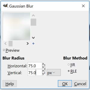
One way to look at a design with new eyes is to blur a screenshot of the page. It removes much of the detail and lets the major parts just barely shine through. I find a 75px Gaussian blur in Gimp works well on a 3k+px width screenshot.
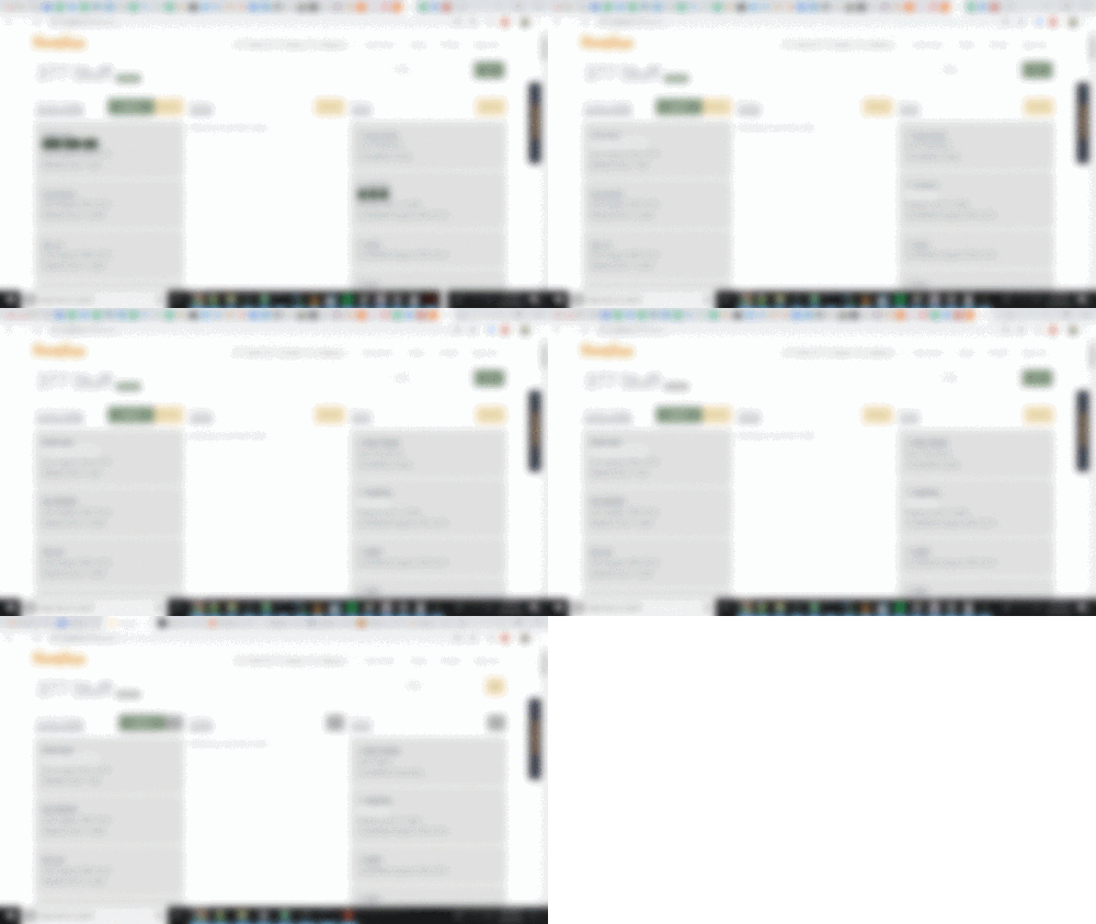
To showcase a session of blur design, follow the progression below. I’m intentionally only showing the blurred versions. Seeing the actual design would add information. At this stage, we’re just looking at initial new user impressions and visual cues.
The page is a home task board at homlina.com. The user can move tasks around in a pre-defined workflow. They can open and edit a task, create a new task, filter/search, or hide all tasks in column. Creating and editing task are primary functions. The tasks can be moved in the edit dialog, or via drag and drop. This is also a primary function. Next comes filtering by name or tag. Then comes hiding task lists and renaming a task board.

Before
It was clear when I first saw this that the dark boxes near the middle of each column looked very prominent. They’re just the display of tags associated with the task, They’re associated with filtering (which is a secondary feature) but they rank high visually. These are the first parts to fix.

Update 1
That’s better. The tags do contrast with the task cards but are much less prominent. Those task cards can be edited by clicking on the task name and is primary functionality. From this screenshot, those titles aren’t much different from the rest of the task card. Let’s boost the size and contrast of the task names but only a little bit. Because there are many tasks on the page at once, too much contrast would be cluttered and self defeating.

Update 2
Now the task names are a little darker. It’s subtle, but better.
That top section has lot of color. Color draws attention but most of those actions are secondary and tertiary features. The green button on the left is the button to create a new task. That button should be a clear primary feature. The others, not so much.

Update 3
Minor update. The top left task board name has an edit button. It’s a very minor feature and now it no longer is so prominent as a grey button instead of green.

Update 4
Two updates here: the filter bar on the right is now a yellow “secondary” color. and the yellow “hide” buttons on each column are now grey. The hiding feature isn’t as important as creating, editing, or filtering.
Conclusion
The Curse of Knowledge makes it hard to design with a new user in mind. Blurred screenshots allowed only the most basic information to come through.
Before the updates, colors and contrast drew attention to less important features. After the updates, the primary features have the most color and contrast. The blurred screenshots allowed me to see the site from a new perspective.
